The science behind a perfect luxury hospitality Instagram grid
Aman, BVLGARI Hotels, and Cheval Blanc Paris all understand a truth most hospitality brands miss: luxury communication is not visual abundance, but visual coherence.
Their feeds are not content streams — they’re distinct digital experiences.
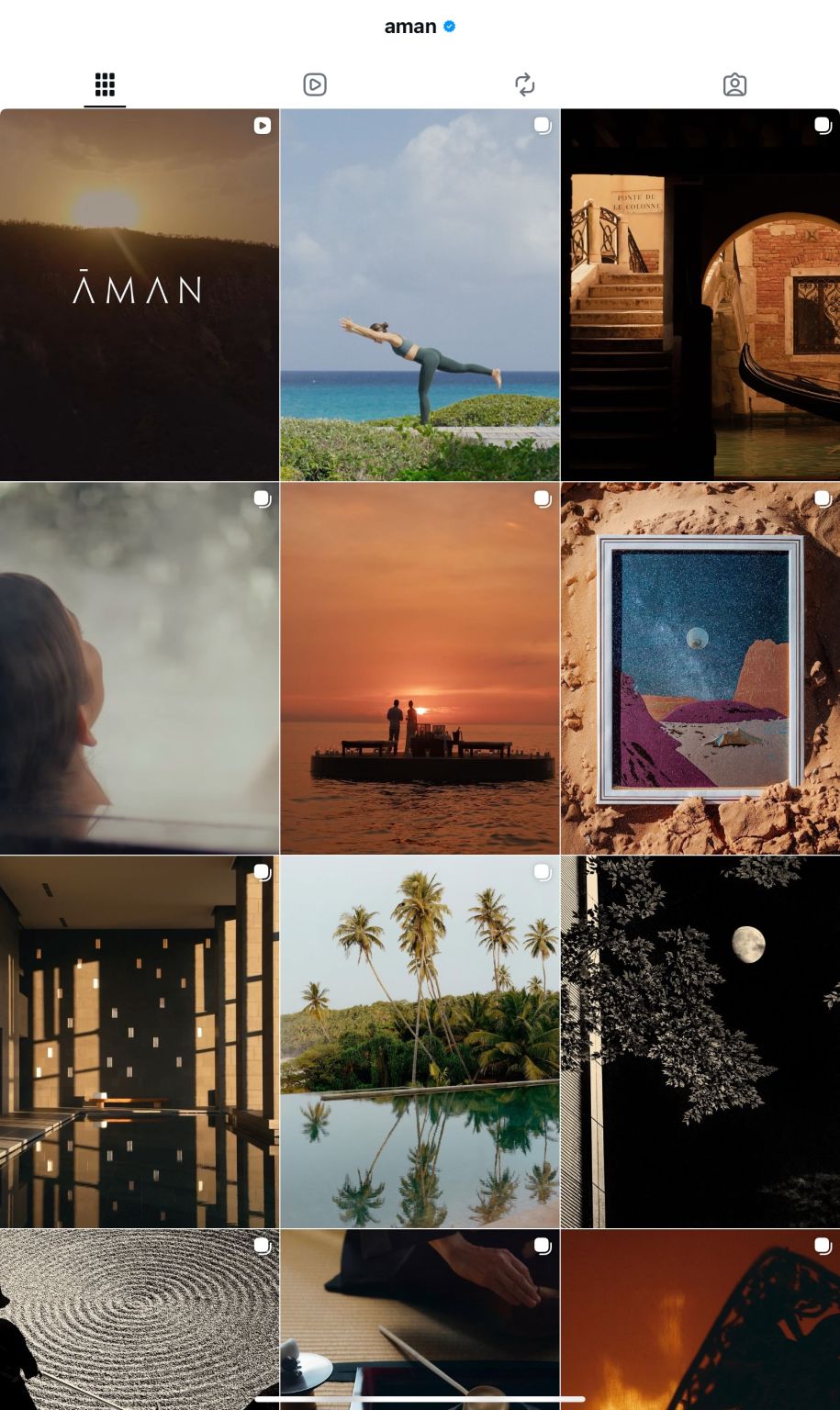
1. Aman — The power of absence.
Aman’s feed uses negative space, silence, and slow visual pacing as branding tools. There’s almost no call-to-action, no text overlays, no people looking at the camera. By removing noise, they create a sense of peace, all following their philosophy about peace as a new luxury. Their brand philosophy translates directly into their digital identity.
2. Bvlgari Hotels & Resorts Paris — The art of sensory details.
Bulgari’s content relies heavily on texture and touch: golden tones, tactile close-ups, and human gestures. Their imagery bridges the sensory gap between physical and digital — you can almost feel the textures, the warmth of the light or the coldness of the marble.
3. Cheval Blanc Paris — The language of structure.
Cheval Blanc’s feed feels more architectural — both literally and editorially. The grid reads almost like a design magazine: clean lines, balanced whites, curated compositions.
💡 Across all three, the same codes repeat: controlled palette, visual rhythm, emotional restraint, and narrative continuity.
——————————————————————————————
📩 I’m opening a few consulting spots this November for hospitality and lifestyle founders looking to refine their brand presence.
If your brand feels beautiful but not yet coherent, let’s shape a visual language that speaks to today’s luxury client. DM for more info.
#LuxuryBranding #VisualIdentity #DigitalPresence #AestheticsOfLuxury #BrandStrategy #Luxury #LuxuryHospitality