You may think that by using an aggregator, or by booking directly with an airline, you’re getting the best deal on a flight.
You’re probably not. Sometimes not even close.
Here’s the catch: the costs are hidden inside checkout funnels, where you have no easy way to compare alternatives.
It’s a cocktail of product psychology and deceptive design.
This 3-part series explores the techniques that each participant uses and how subtle design cues can alter your behaviour.
At times it borders on the obscene—such as encouraging customers to pay £2.90 to receive an SMS via an “upgrade”.
We’ll cover how brand value is built up over multiple sessions, making you less and less likely to shop around.
Let’s start by looking at the experience of searching and selecting flights.
Case study
3 lessons for product builders
1. Think in sessions
It can be tempting to compare products (especially yourself against competitors) through the lens of a single session.
For example, you could look at the number of clicks it takes to complete a search, to very roughly measure effort.
Sure, some are slightly more efficient.
But given the required inputs (i.e., airports and dates), somewhere between 9-11 clicks feels fairly optimised. That’s a single snapshot.
Now think about what happens if you come back the next day.
How many clicks is it to make that same search?
There we go—now there’s a difference.
Comparing the experiences over multiple sessions is necessary in this industry, because conversion rates are so low (0.7% on mobile).
If you’re interested, here’s a breakdown of why 91% of Delta’s customers churn.
But as a general tip for product builders, you need to know if you’re being judged on a single session, or over a period of time (and how long).
2. Insider blind spots
Conceptually, it’s easy to grasp how the 🏋️♀️ Labour Illusion warps someone’s perception of value.
We associate value with things that required effort to create.
But it’s common for teams to develop a blind spot for recognising this bias in their own products.
It’s possibly because as an insider, you compare yourselves to your competitors, and what they can do. Or perhaps a founder’s optimism and forward-planning detracts from the effort you’ve invested so far.
This blind spot costs companies money, because they choose not to leverage this bias.
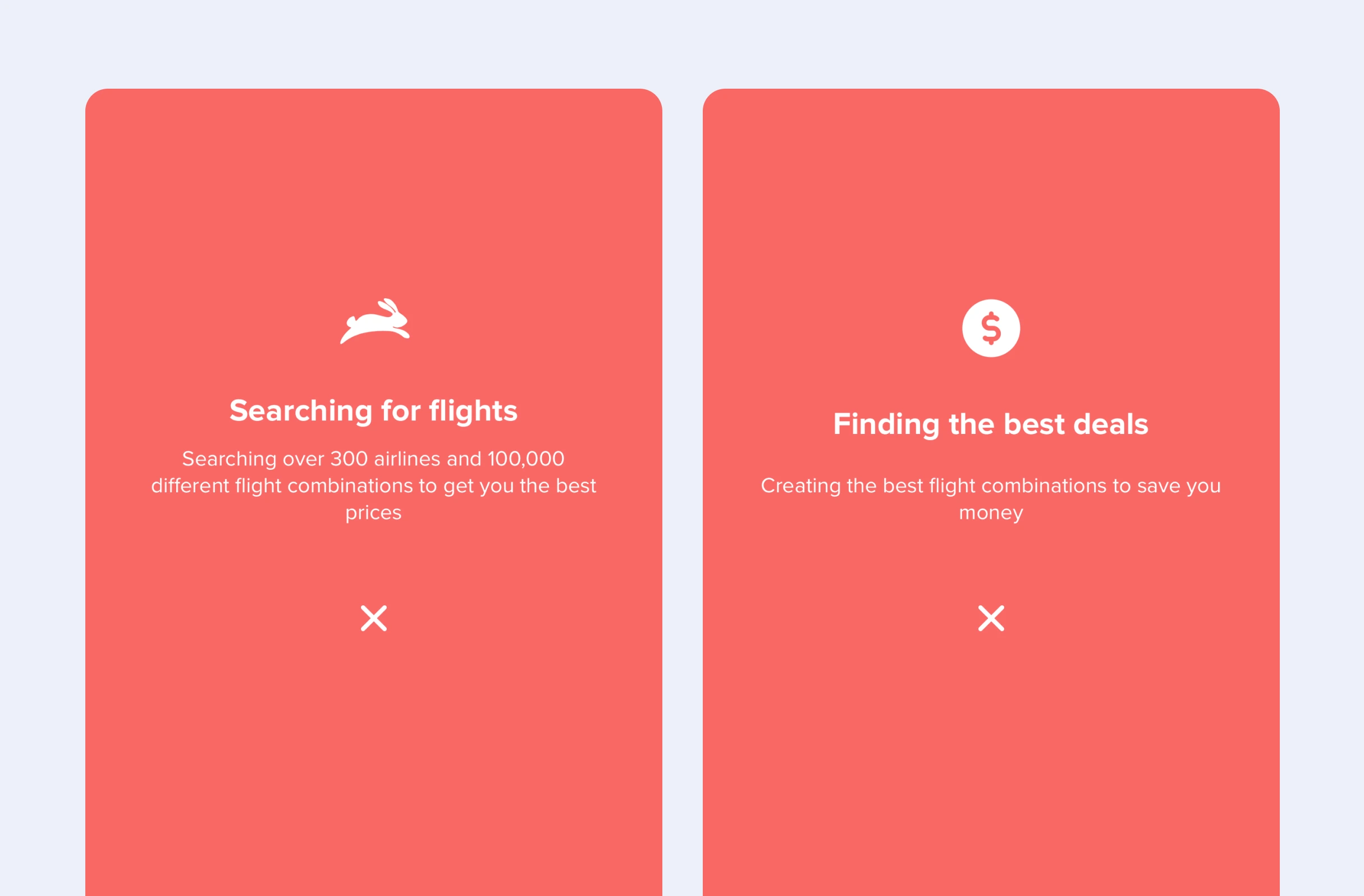
Ask yourself: does the average Skyscanner user know how many airlines they’re crawling? Is it 50? 100? 500?
Customers need to be reminded—so why not tell them while you fetch results?
In the case study, we saw a few other approaches to 🖼 Framing this moment.
Kayak opt to remind you that they’re searching for lower prices.
Let’s compare this to the almost identical lazy loading state Booking use.
Both Kayak and Booking are technically doing the same thing—but which feels more valuable?
“Almost done” is a wasted opportunity.
3. The value of an interface
In the third chapter of this series, we’re going to get into the weird and deceptive world of checkout upsells. Warts and all.
But something to consider today is how valuable showmanship can be to driving action.
i.e., how these techniques (such as loading states, framing and biases) “create” value.
This doesn’t have to be theoretical—Expedia let you experience travel planning without the interface, via ChatGPT.
But what do you notice?
It confidently suggests three options—all of which unnecessarily have layovers, and that are at least 10% more expensive than a direct flight.
More importantly, ask yourself how confident you’d feel in selecting any of them.
My point isn’t to trash the quality of the response, that’ll improve over time.
Instead, I want you to recognise that in this context the interfaces are more than a means of accessing data.
You might literally be able to ask an AI Agent to find and book you a flight, but for now, the small gain in convenience would require a high tolerance to being overcharged.
What’s coming up…
Like the Fellowship of The Ring, I’ve had to lay a lot of the groundwork early.

Over the next two chapters, we’re going to explore:
- How (some) of these companies have effectively built brand value over multiple sessions (retention)
- How the checkouts are designed to drive action (conversions) while overcharging you (and by how much).
- How to increase the chances you actually land on a good deal.
UX Exercise
What is the Labour Illusion?
Select an answer