Still talking about fonts.
Apparently, my typographic crusade has now evolved into something resembling a holy war—less Deus Vult, more “remove formatting” just to figure out how much a double room costs.
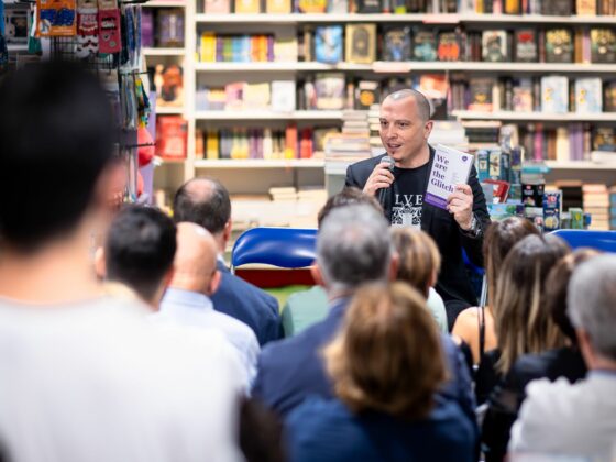
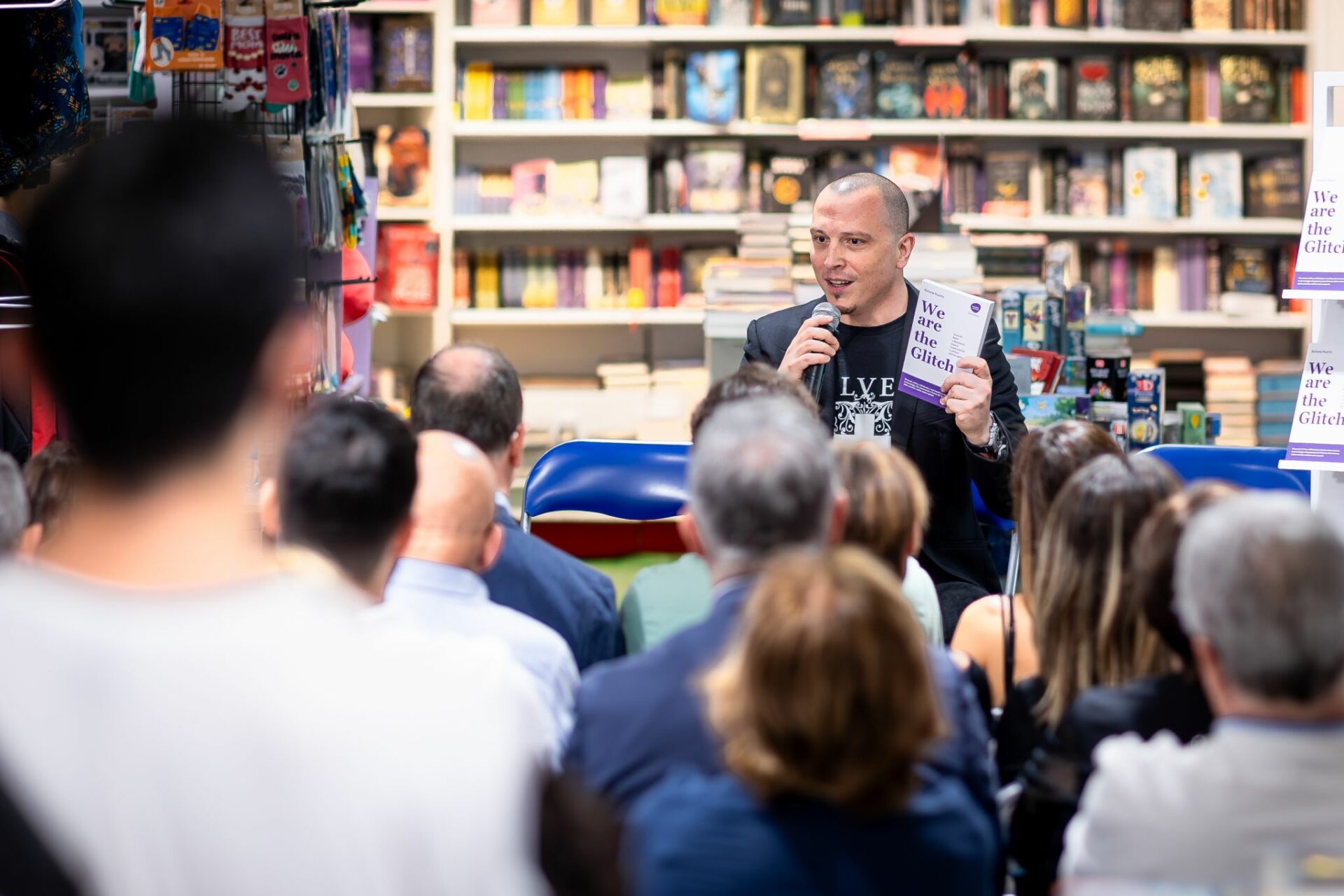
Following a LinkedIn post in which I complained about receiving a hotel quote written in an unreadable font that looked like it had been lifted from an ancient Egyptian scroll https://www.linkedin.com/posts/puortosimone_ancora-sui-font-perch%C3%A9-evidentemente-%C3%A8-una-activity-7451948351786393601-D0dx), one comment reminded me of something fundamental:
Readability is, above all else, accessibility.
And accessibility starts long before wheelchair ramps, compliant bathrooms, or the obligatory ESG badge proudly displayed in a brochure.
It starts with Arial. Verdana. Open Sans.
It starts with spacing, contrast, left alignment, and all those tiny design decisions that our industry continues to treat as aesthetic details when they are, in fact, part of the cognitive infrastructure of communication.
Because if someone like me has to navigate an email the way Indiana Jones navigates the Temple of Doom, we’re no longer talking about personal taste.
We’re talking about exclusion—albeit a particularly elegant form of it.
Then there was the line about the “skilled and attentive female staff” who would make my wellness experience “exclusive and complete.”
A phrase that felt unsettling.
Not because of what it says outright, but because of what it quietly implies.

It carries the unmistakable scent of an outdated 1980s brochure, the kind of marketing copy that never quite escaped the era of beach comedies and questionable stereotypes.
Beneath that seemingly innocent wording lies something more problematic: a sort of “Spa Edition Patriarchy,” where female professionalism subtly slips into a supporting role, suspended somewhere between service and servitude.
Setting the “attentive female staff” aside, the broader point is simple:
Design always communicates.
Even when it communicates badly.
And sometimes a font choice—or a sentence borrowed from a low-budget holiday comedy—reveals more about our understanding of hospitality than any brand manifesto hanging behind the front desk.
See you next week,
SIMONE PUORTO